ATLANTA — When rapper T.I. arrived at Philips Arena to perform before Atlanta’s home opener against Indiana on Nov. 1, he was asked which Hawks jersey he wanted to rep.
“We had lots of options,” Hawks chief creative officer Peter Sorckoff said. “But he opened up a bag and pulled out a lime-green flat-billed New Era hat with the blue brim — he just showed up with it. He said, ‘Man, I want the green one.'”
It was a 1970 Pete Maravich jersey, a throwback to the funky, avant-garde uniforms with green accents that Atlanta wore for just two seasons, and it remains one of the team’s best sellers.
It felt like a serendipitous nod to Sorckoff, who was already months into planning the new uniforms the Hawks unveiled on Wednesday.
“It almost validated what we wanted to do,” he said. “We would’ve chosen [green] anyway even if it didn’t forecast well because of what it meant to us and to our history, but there’s a very real science behind it.”
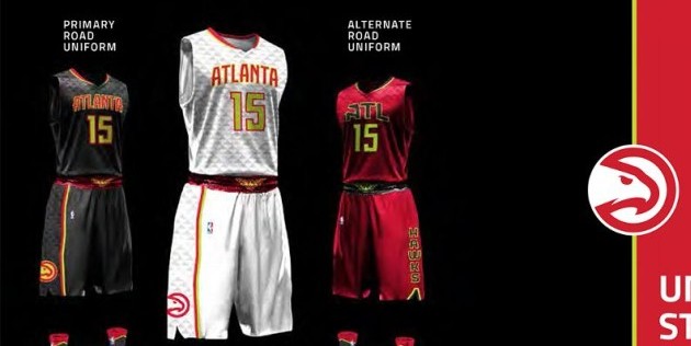
Atlanta’s new jerseys include repeatable feathery V patterns, recalling a swooping bird of prey, and the collegiate ability to mix and match tops, bottoms, socks and even shoelaces. But Sorckoff is most excited about the surprising introduction of a road charcoal jersey the team calls Georgia Granite Gray. It’s highlighted by bright green accents, like Maravich’s shade but electrified, that were previously hinted at on the team’s 2015 Christmas jerseys.
“It’s the most arresting,” Sorckoff said. “The gray is a color that’s new for us, and really to the best of my knowledge has never been deployed anywhere in the NBA before. Between that color and the Volt green, we feel we’re doing something that’s never been done before.”
Even within the world of marketing, the notion of color forecasting is nebulous. Companies like Pantone zoom out and take macro views of cultural shifts to decide which direction certain shades are trending. It can be as simple as brighter colors receiving a boost because superhero movies are having a good year.
Volt is en vogue. It’s still a relatively fresh look that visually pops on HD screens and invokes a sense of speed. The Seattle Seahawks wear a version of it. The U.S. women’s national team is currently competing in the Women’s World Cup in uniforms with Volt trim, and the same look has recently infiltrated the Pro Bowl and the NHL All-Star Game.
Maybe most famously, the University of Oregon’s football team has sported the look off and on during the past half-decade. The Hawks would be proud to draw that comparison. Early in the design process, Sorckoff even called Oregon assistant athletic director Craig Pintens to pick his brain. Oregon lets players have a large say in what they wear on the field — a major recruiting boon with the corollary benefit of increasing team bonding and communication.
“What the coaching staff really wants is athletes that are involved,” Sorckoff said. “Within the millennial set, that really resonates. They know that we want to appeal to a younger group.”
Not every Hawks player was initially on board with the style’s micromanagement, so Sorckoff focused on explaining why he believed in the new look.
“I asked them, ‘Are you going to be OK wearing a certain sock? I might even ask you to wear a certain lace color,'” Sorckoff said. “If you think about our story this year, it’s really about being a team. While that doesn’t mean losing your individuality, it can mean giving up some for the greater good.”
It also meant a lot of back-and-forth. Sorckoff recalls a conversation with Hawks forward Kyle Korver about an early prototype that tested flared sleeves. Last season’s most accurate 3-point shooter was hesitant about anything that could affect his stroke.
“It was cool that the shoulders looked like that, but Korver was like, ‘I gotta have straps. I can’t have heavy shoulders because I feel like that’s going to hurt me when I’m shooting.'”
On the flip side, once players realized the depth of the team’s commitment to experimentation, they began coming up with their own subtle requests, according to Sorckoff.
“[Players] said, ‘If you can do all of that, can you maybe do this too? Or this? Could you tweak this a bit?'” he said. “It was really a collaborative process.”
Much of the past two years has been spent redefining the Hawks’ brand — everything from the logos to the concession stands — in an effort to appeal to younger and African-American crowds.
The Hawks employed Chicago-based MotiveQuest, a data-insight company which uses decommissioned NSA software to canvas the web to search for specific topics. The firm used advanced algorithms to parse millions of online conversations about the Hawks, dumping them through filters sorted by topic and sentiment.
One major takeaway was fans’ continued love for the Hawks’ old “Pac-Man” logo, a victim of the organization’s mid-’90s rebranding.
So the team brought back a revamped version, one a little sharper and more menacing that is known around team offices as “Evo” — short for evolved.
Next came the secondary mark, a flaming, flying basketball inspired by the City of Atlanta’s seal that fulfilled an NBA rule stipulating at least one team logo centrally feature a ball. That may seem arbitrary, but it comes in handy in unfamiliar territory overseas.
Sorckoff knows he can’t please everyone — that no amount of brand strategy and creative cleverness will convince everyone a new look was a good idea. Art is, after all, subjective.
He also knows the knee-jerk reaction to visual rebranding can be unpredictable — just ask Steve Ballmer.
“Look, this is who we are,” Sorckoff said. “This is what we represent, and we hope you like us. But we also know we’re not for everybody. We’re not out to make everybody like us because that’s just not possible. But if we can be truthful and transparent about who we are, I think that goes a long way.”
ESPN

